An attempt to boost average order value (AOV) by upselling high-ticket items pre-checkout in Bewakoof app .
A Product Design Challenge Case study

Introduction
Welcome to this case study documenting a thrilling 48-hour product design challenge, where participants of a hackathon were tasked with enhancing an existing fashion ecommerce app.
In this intense event, each participant was assigned an individual problem statement and given just 48 hours to develop a minimum viable product (MVP) solution.
The mastermind behind this exciting challenge was none other than Anudeep Ayyagari, a highly experienced UX designer at Amazon and our respected mentor
Problem statement
Among the talented participants, I was assigned a fascinating problem statement: Which was to design an upselling feature to sell highticket items pre checkout for the Bewakoof app.
Bewakoof is a popular direct-to-consumer fashion e-commerce platform targeting the Gen-Z demographic.
Potential solution
To tackle this challenge, I devised a potential solution that involved developing a carousel of relevant high-ticket items tailored to each user's purchase order.
Since my focus was on t-shirts, I incorporated influencer-curated t-shirts as my upselling point.
By presenting users with a personalized selection of 3 to 4 options, this solution aimed to empower them to make informed purchase decisions.
Additionally, the inclusion of influencer-curated t-shirts added value and elevated the perceived quality of the products, potentially increasing the average order value for the Bewakoof business.
Join me on this journey as we explore how a small yet impactful addition can revolutionize the user experience and drive business growth.


Final Solution

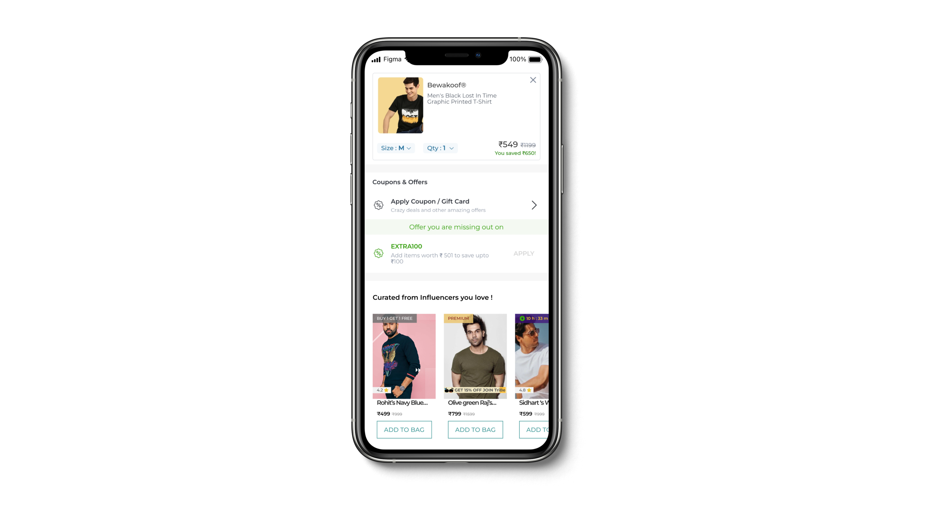
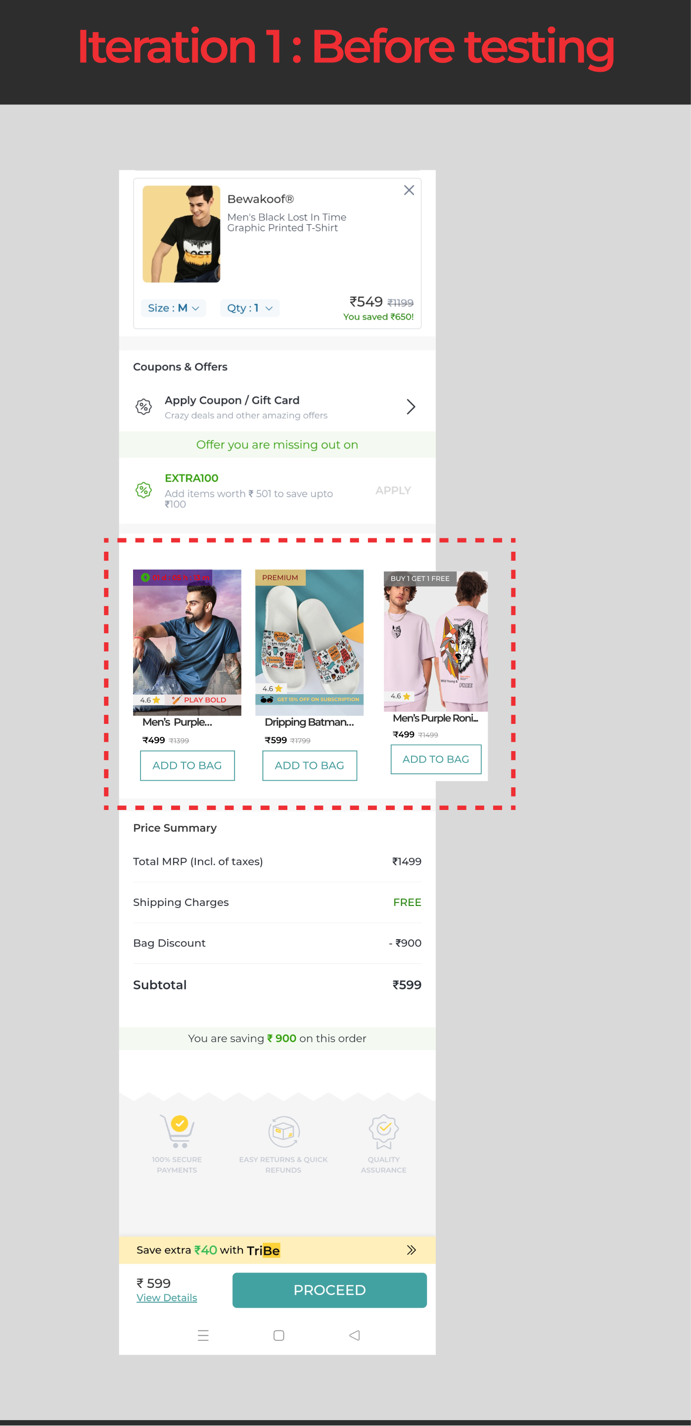
Before I explain the final design lets look at what the existing checkout page looked like !
The current page already has a pattern of upselling through offers that encourages users to buy more items, thereby increasing the cart value
While scrolling through the checkout page, I noticed that there were no T-shirt recommendations based on the items in the cart.
This made it clear to me that the upselling strategy on Bewakoof was not well-designed.
This presents a potential opportunity to increase the average order value (AOV) and overall revenue, which was lacking in this case.
Let me explain what I designed to solve this problem
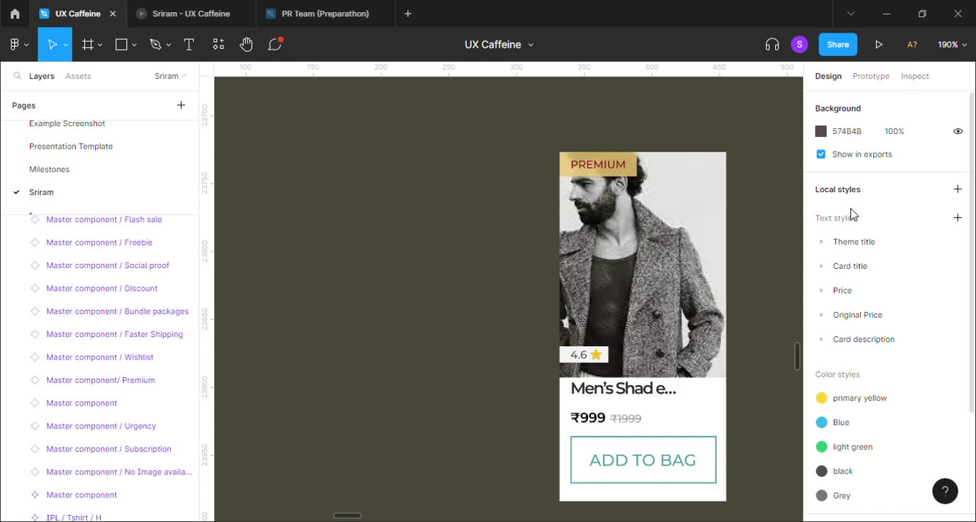
I created a carousel featuring product cards that were specifically aimed at upselling influencer-curated T-shirts, personalized to the items added to the user's cart.
Based on my primary research, a list of product recommendations curated from influencers such as actors and cricketers had a high likelihood of generating upsells.
To accomplish this design, I adhered to Bewakoof's existing design system and incorporated various reinforcements into the cards.
I created various types of reinforcements in the product cards that evoke different emotions and communication.
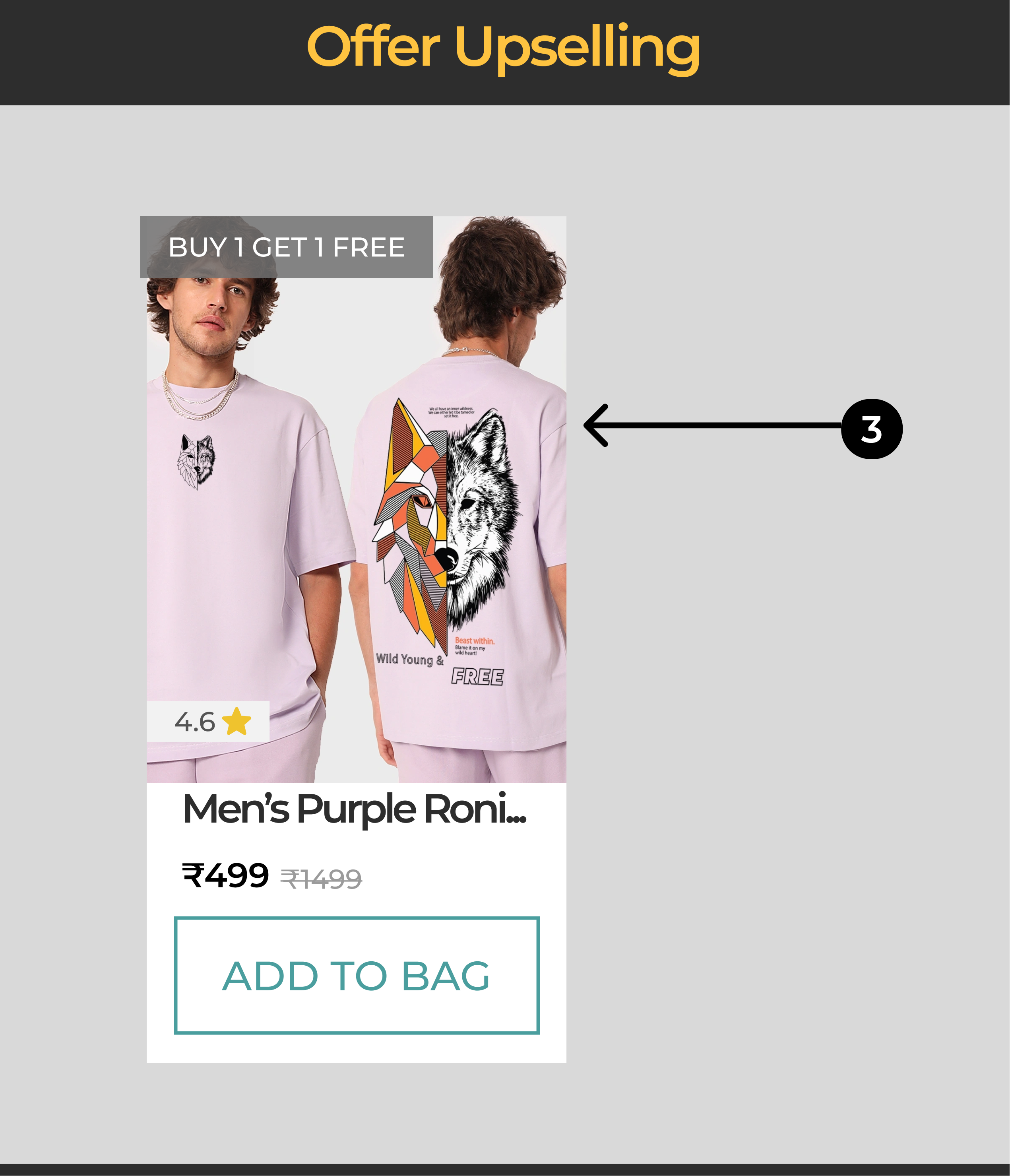
A. The Buy 1 and Get 1 offer is a classic example of freebies that give a dopamine boost at the end of the purchase.
B. On the other hand, the Premium tagline creates a sense of exclusivity and higher value compared to other items.
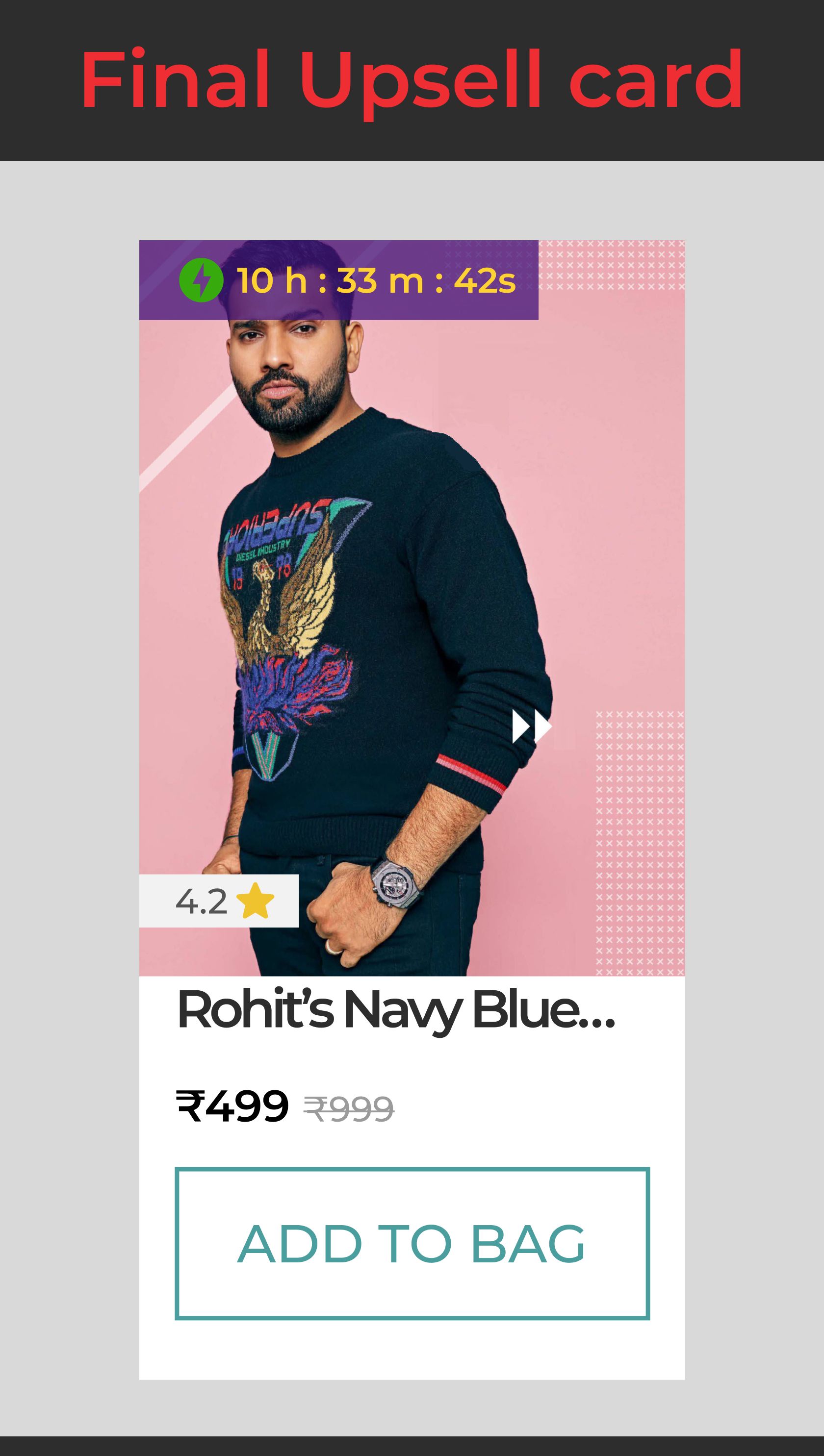
C. Meanwhile, a flash sale timer creates a sense of urgency for the user, triggering a FOMO effect to purchase the product.
These are just a few examples... more will be coming along the way 😉.
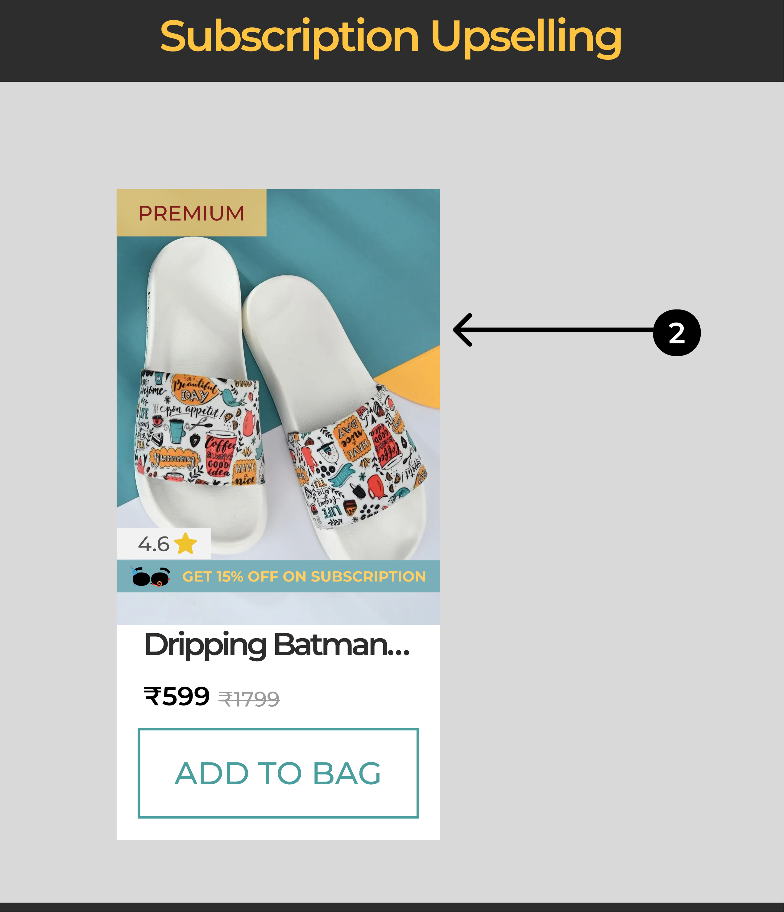
While using the app, I discovered that Bewakoof offers a subscription plan called Tribe, which is a premium product but has low visibility.
Upselling the subscription is a way to not only increase the retention rate for Bewakoof but also to keep a loyal customer base.
How did I reach to this solution : Lets explore !
Critical Decision 1 : How did I come up with layout of the Upsell card ?
While designing the upsell card I had 2 main objectives :
A. The Upsell card should be consistent with the product cards of the app (Consistent with existing design system ) to make sure users do not get confused that something has just popped up losing trust before upselling
B. The cards shall accommodate a wide range of use cases to be used any where within the app
Decisions and Iterations of Upsell card

✅ What features I added and Why I think this might work ?
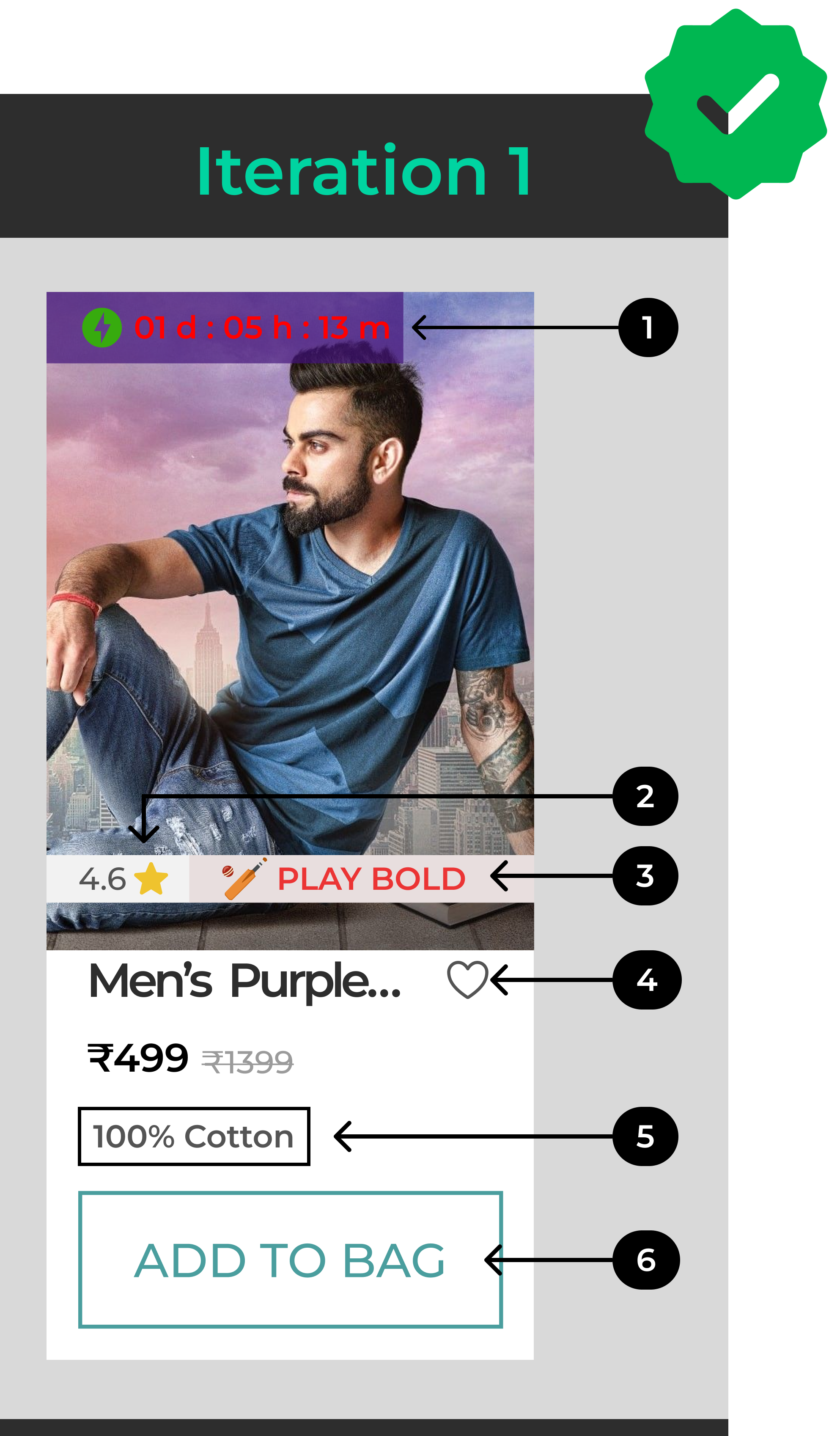
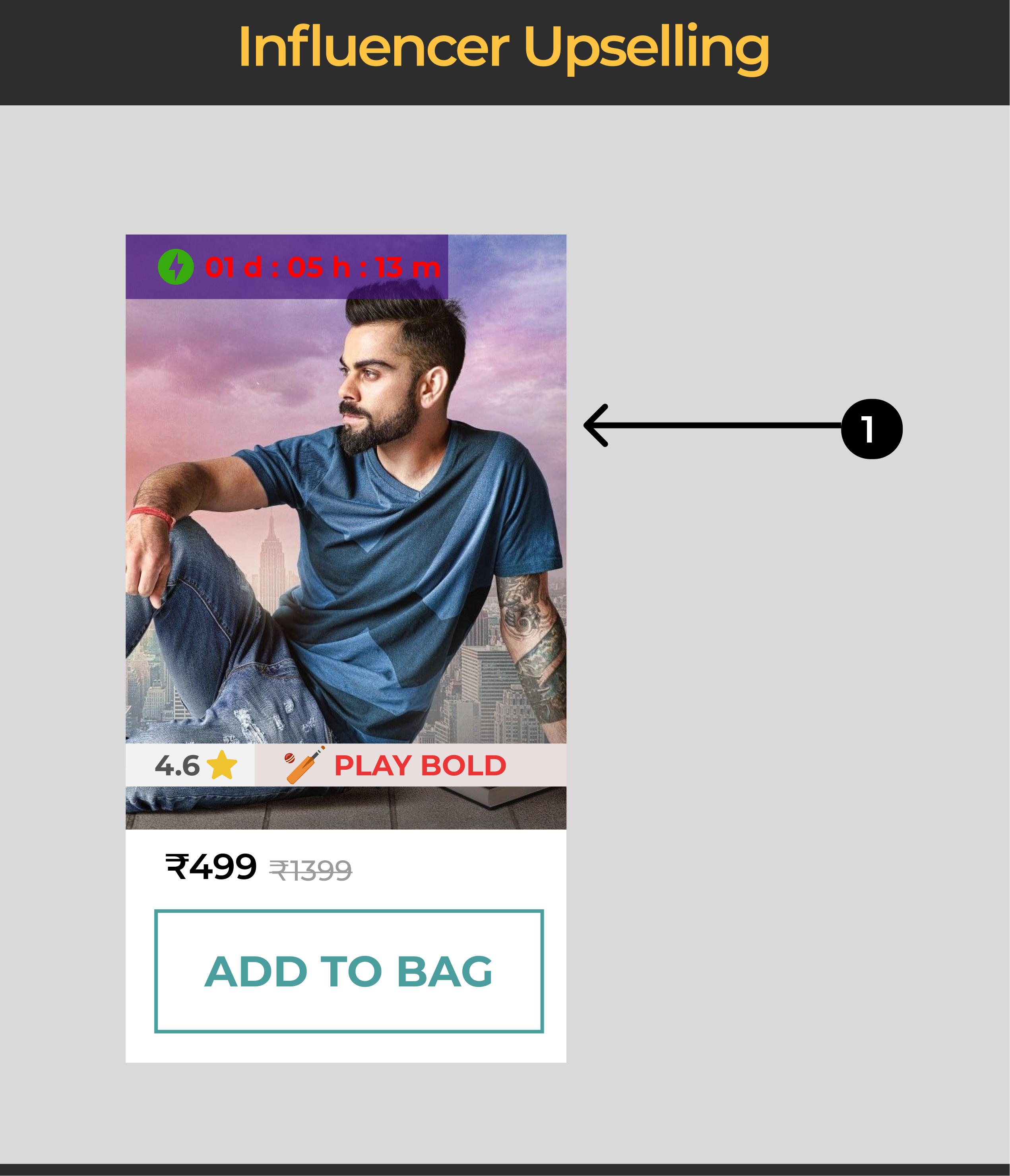
1. I followed the existing design system of bewakoof and tried to maintain the left aligned reinforcement pattern.
2. I Chose to add ratings as a part of the card to gain social proof along with potential upselling factor ie. Influencer branding the T-shirt
3. I chose to upsell IPL oriented seasonal upsell along with Sports influencer like Virat communicating the mission statements of their respective teams in the card
4. I planned to have a wish-list feature to help users have a freedom to save even at the upsell point
5. I picked up the brand material to be important as it was a standard with all product cards in Bewakoof
6. I made the CTA's surface area larger for easy accessibility and faster checkout

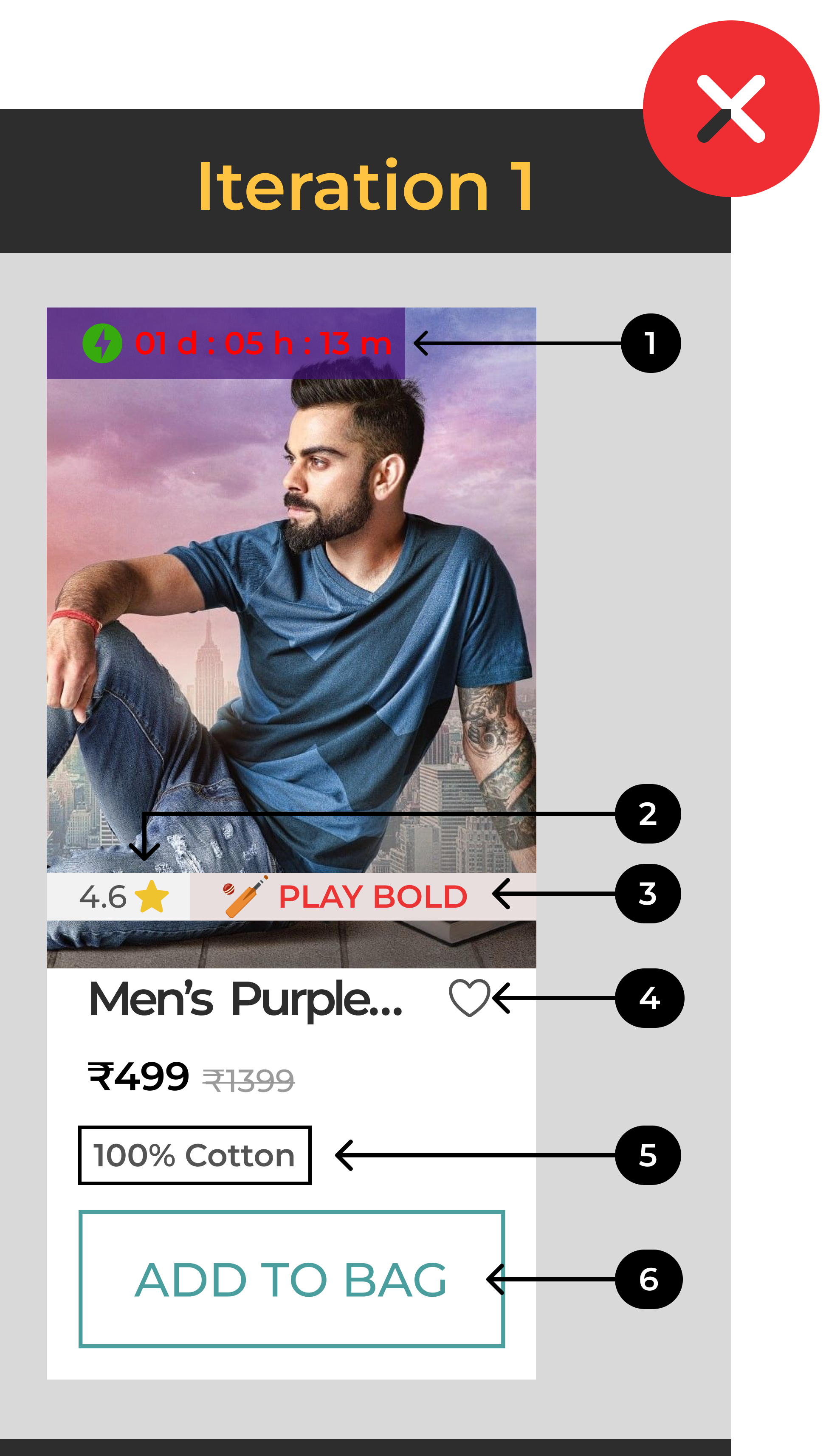
🚩 Limitations of this design
User might find it difficult to consume all this information at once.
On Competitor research I understood that wishlist was infact not a standard pattern while upselling
Giving too many details like the material type in the upsell card can be distracting from main motive ie. to upsell faster

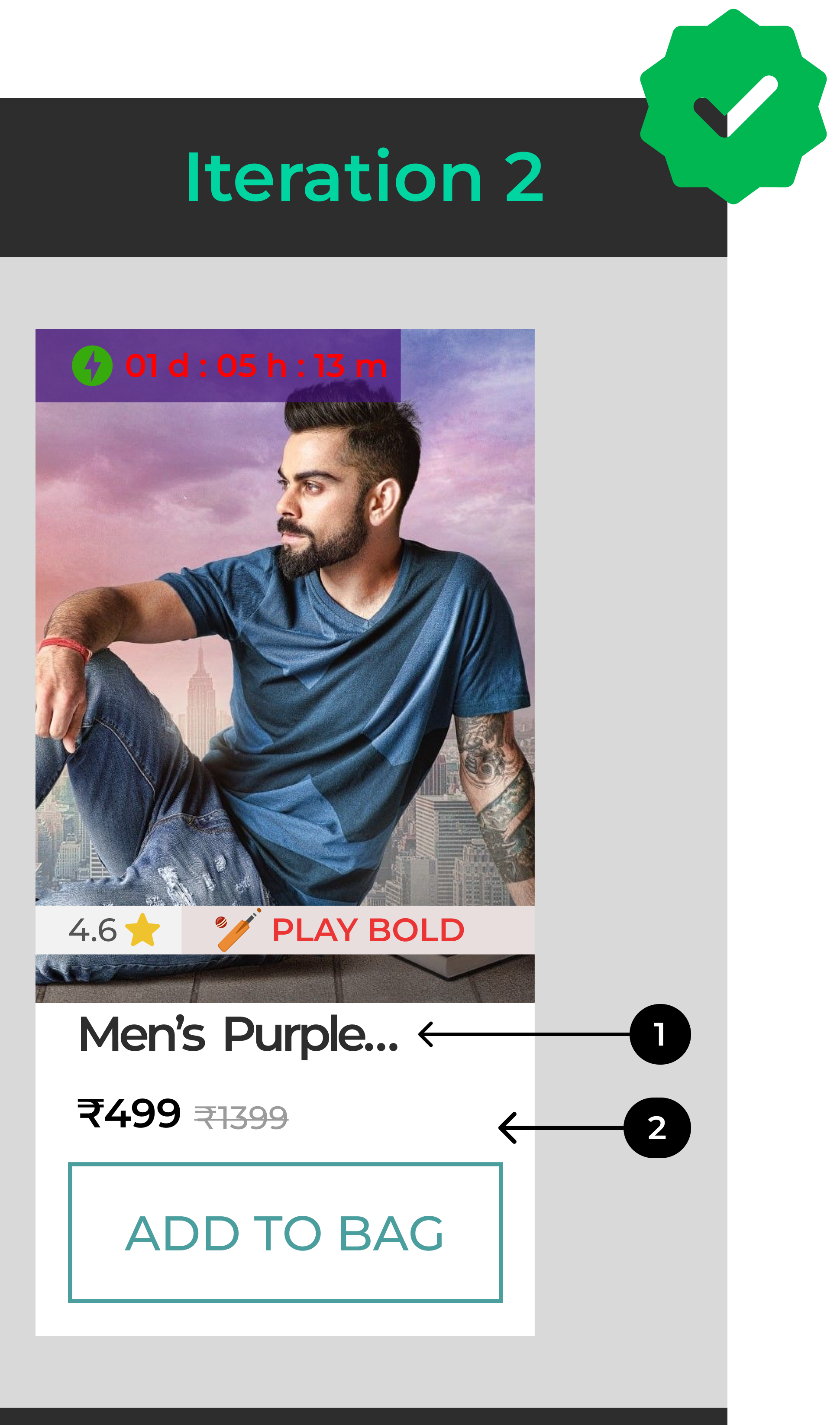
✅ What changes did I make and Why ?
1. I removed the wishlist feature to avoid users to focus on purchasing right away instead of moving things for later which contradicts the purpose of the feature.

2. I also removed the details of type of material though it was an existing pattern in the product card as it also can turn out to be distracting observed during competitive analysis of apps like
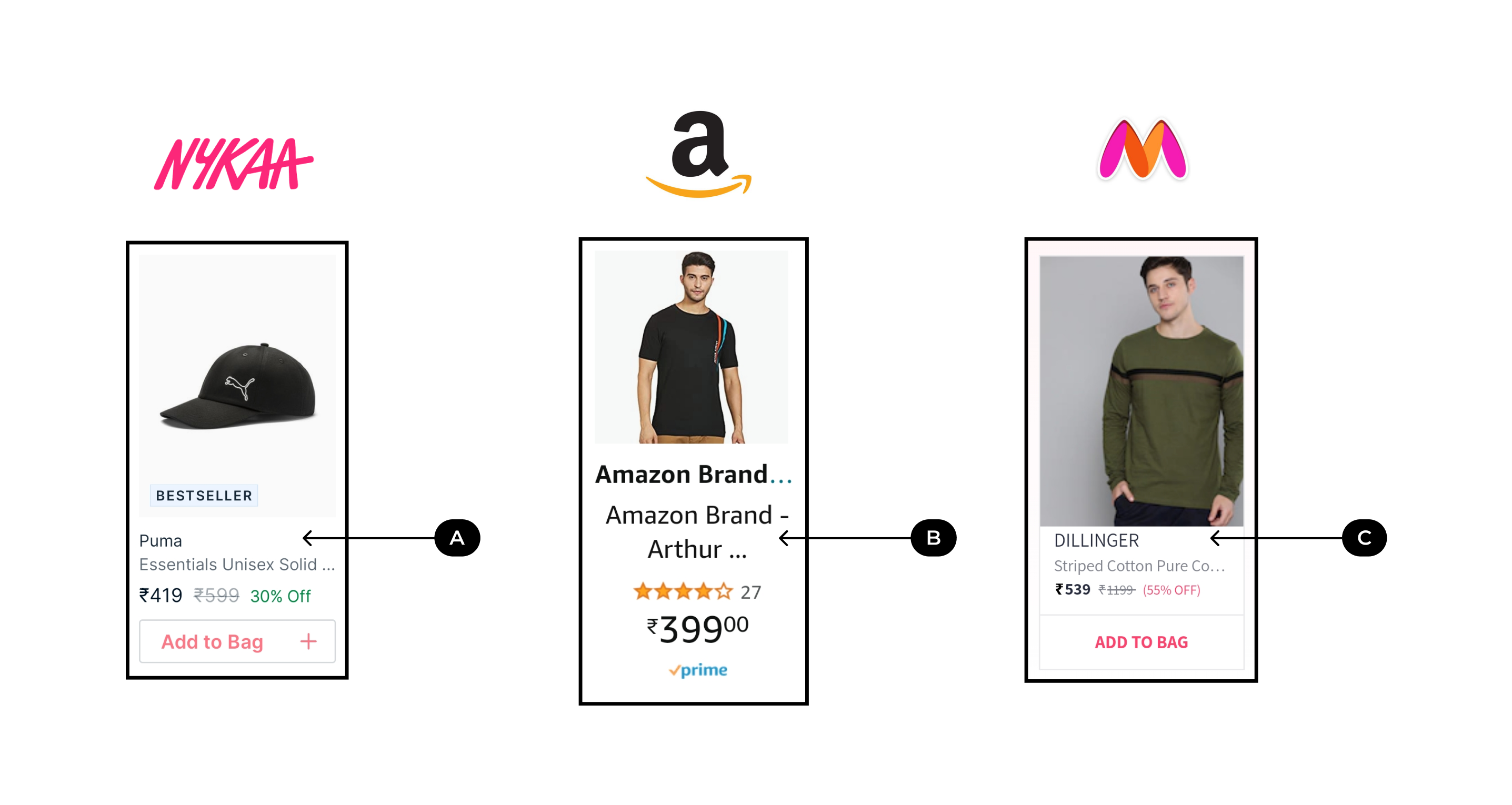
A. Nykaa : Nykaa had limited information the main pattern I observed was the contrast of Add to bag was well highlighted for users to checkout rapidly
B. Amazon fashion - has the most simple design of card , the ratings was highlighted with number of people who rated it which adds an element of trust for user
C. Myntra - has the peculiar uniformity in the text style with titles of the cards entirely on CAPS which makes it differentiate from rest
All these patterns helped me understand " Minimalism and functionality is more important that user control and freedom when iit comes to designing upselling card "

🚩 Limitations of this design
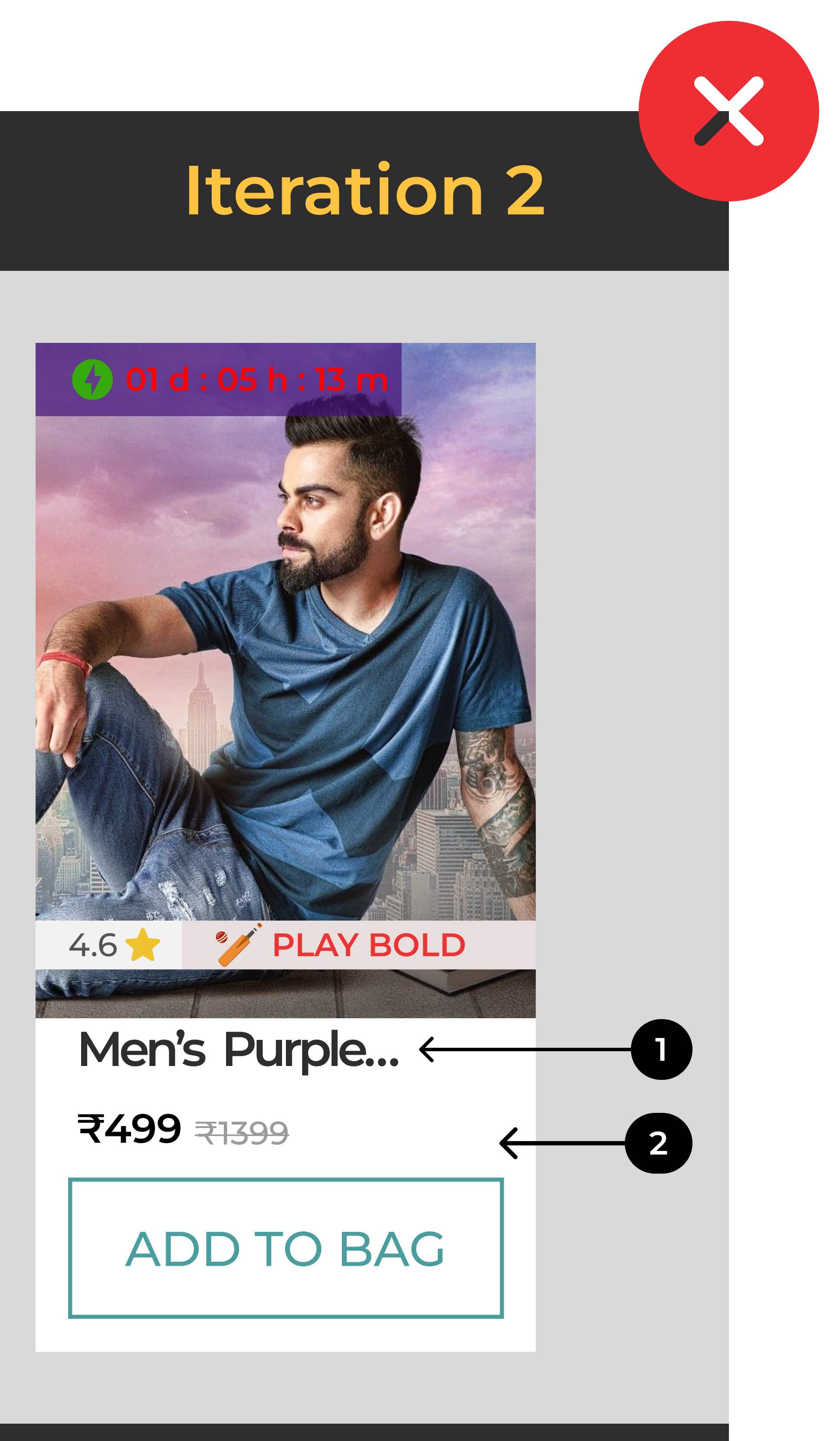
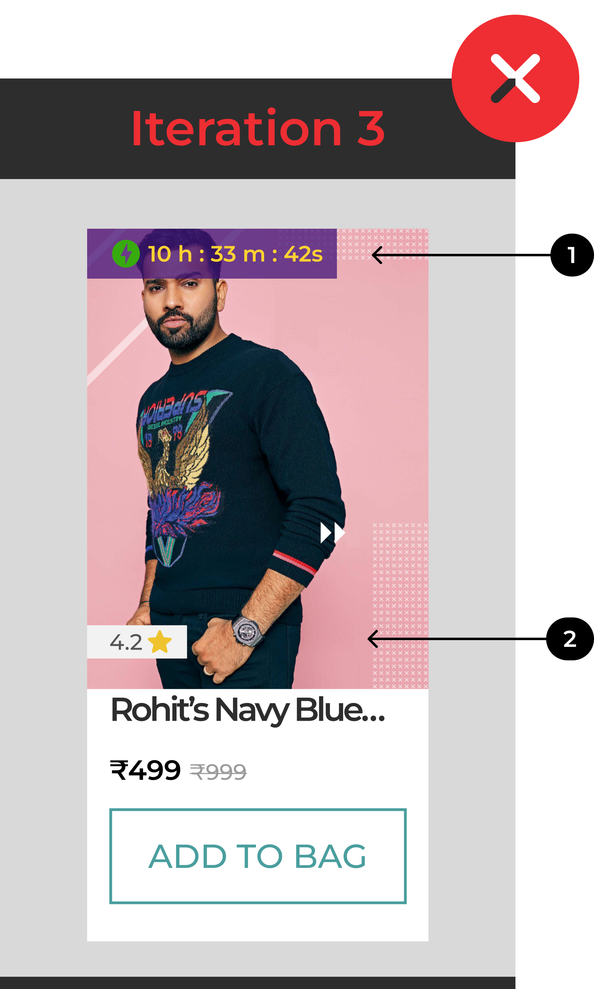
While user testing I observed that they weren't able to read the count down timer. Though they understood that it was a sign of flash sale by guess work
Users were confused by the fashion statement " Play Bold " as the T-shirt did not have any indication of IPL promotion from Virat.

✅ What changes did I make and Why ?
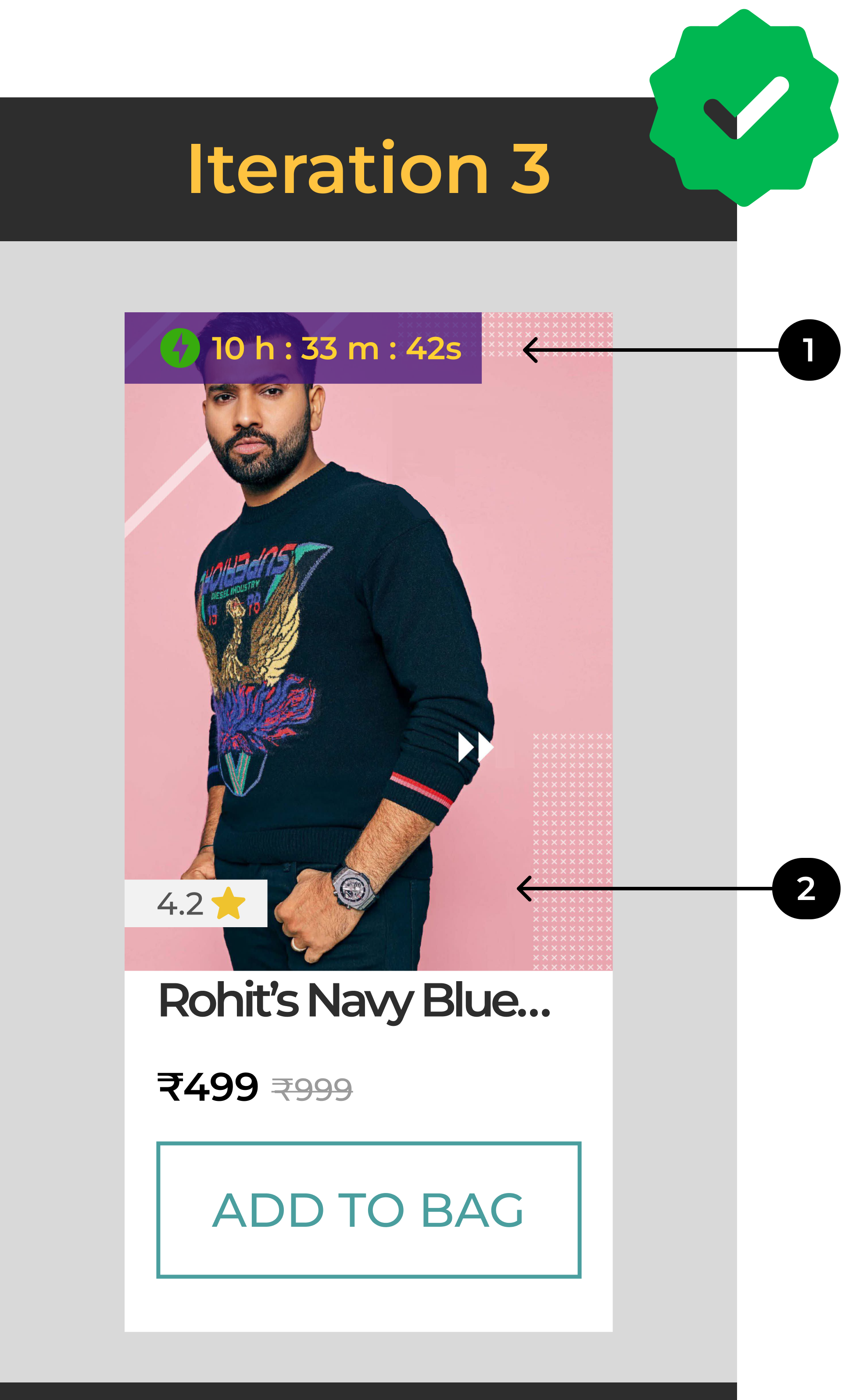
1. I optimized the contrast ratio to match WCAG guidelines to have good readability and comprehension which was possible feedback I got only after user testing
The contrast ratio between the button's text and its background should be at least 4.5:1. and I changed the contrast ration to 9.07 which is decent for readability

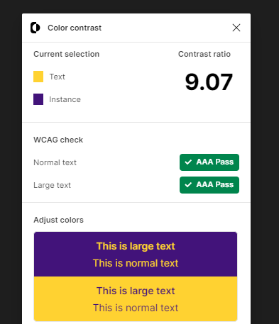
Color Contrast Plugin to test the contrast ratio match WCAG Guidelines
Color Contrast Plugin to test the contrast ratio match WCAG Guidelines


Usability testing with 3 users helped me gain insights on the readability and build a general framework for upselling
Usability testing with 3 users helped me gain insights on the readability and build a general framework for upselling
2. I removed the " Play Bold " statement as users were not finding the content really matching the T-shirt . Though influencers shown were cricketers the T-shirts were not related to IPL so users were not able to relate with it.

🚩 Limitations of this design
The users might still face issues with readability of reduced card size of Upsell card over the product card or existing card at checkout which cover a much larger surface area
The card did not have reinforcement of offers and amount saved ; I did not add them as part of this iteration to avoid too many information and keep the primary focus of influencer image clear and CTA larger
There is a requirement of testing for this iteration again but was not able to do that because of time constraint
Critical Decision 2 : What highticket product should I show to the user so that they buy the highticket item ?
Iteration 1 : I explored ideas on what to place and where to place the upsell card
Initially I had 2 ideas in mind
A. To use influencer curated T-shirts and promotions and upsell it as a highticket product
B. To Upsell a premium product along with subscription of Bewakoof to increase AOV also retain loyal customer base
To achieve that I studied the competitors for placement of the upsell card and understood that they are mostly placed prior to billing details section

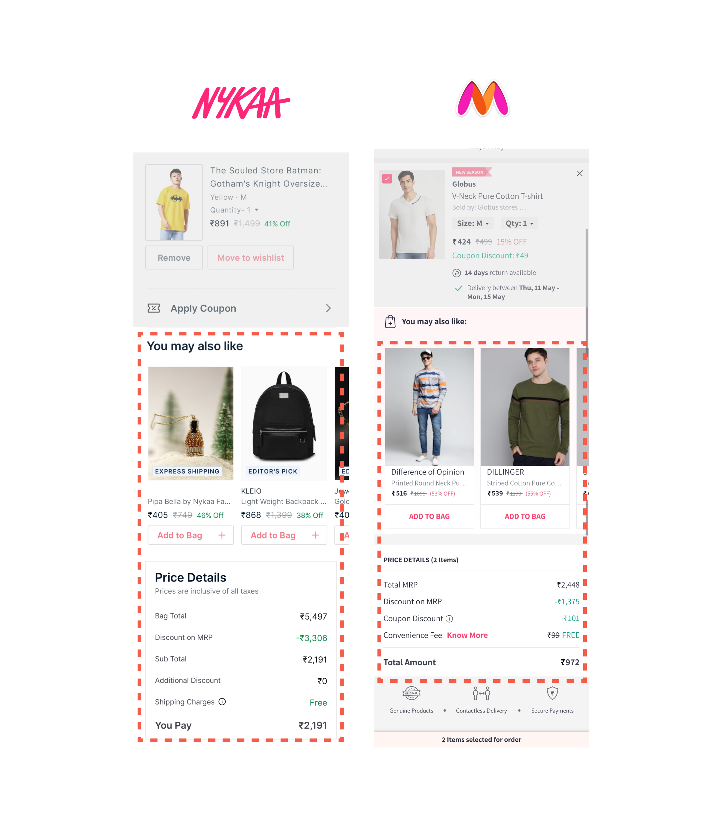
Competitors like Myntra and Nykka had the placement of upselling cards before pricing details section so I also followed the same
Competitors like Myntra and Nykka had the placement of upselling cards before pricing details section so I also followed the same
I decided to follow similar pattern from competitors and placed the carousel right before pricing details

Why did I place the 3 cards in the carousel and what are they ?
1. Virat kohli curated T-Shirt with a timer reinforcement to bring a sense of urgency
2 . A premium sandel from bewakoof with a subscription reinforcement to acquire a loyal customer
3. A card with a reinforcement of BUY ONE GET ONE as a buffer card

To make sure my assumptions are going in the right direction I decided to perform a comprehensive usability testing within the limited time
Iteration 2 : How testing helped me understand the importance of relevancy while upselling ?
I spoke with 3 users of Age group between 23 to 30 years old who has practice of purchasing clothing online; I chose preferably men to test as I was upselling Men's T-shirts.
Goals of the user testing :
1. Are users able to understand the information in the card without explanation ?
2. Understand how each user is percieving information in the card ?
3. Which card would the user prefer and Why ?
4. Understand users purchase decisions after testing

Comprehensive user testing with 3 users
Comprehensive user testing with 3 users
Insights from usability testing
1. Users were not able to visibly read the reinforcements - Contrast ration and following the WCAG guidelines is key
2. Users were confused when they saw a sandal along with t-shirts to be recommended - Personalization and relevancy are important factors for users to consider buying while upselling
3. Users preferred to purchase the Virat Kohli T-shirt over others as it had an element of trust from their favorite influencer which validated my assumption
4. I also understood few purchase patterns like buying in bulk every 3 months , matching of the product price with relevant purchase order had a high probability of being purchased, Users also use the upselling area for comparison with products added to cart.
After these Insights I scoped my design to upsell Influencer curated T-shirts as an Highticket item
Final card design 👇

I have explained in detail how I achieved this design in Critical design decision 1 👆
I have explained in detail how I achieved this design in Critical design decision 1 👆

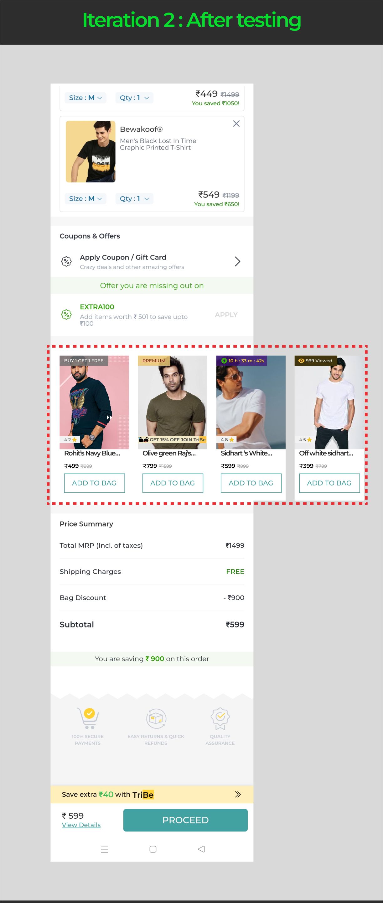
Position of upsell carousel after usability testing
Position of upsell carousel after usability testing
Though I had this Idea to scope down to upsell high ticket items through influencer promotion I eventually took another decision which is .... 💣 " To build a System for upselling items "
Critical Decision 3 : Why did I choose to build a System for upselling over limiting my scope to upselling influencer curated T-shirts ?
“A bad system will beat a good person every time.”
– W. Edwards Deming
Initially when I converged my decision in building the upselling feature I decided to stick with Influencer curated T-shirts but later I asked myself various questions that led me to systems oriented approach.
Here are few examples
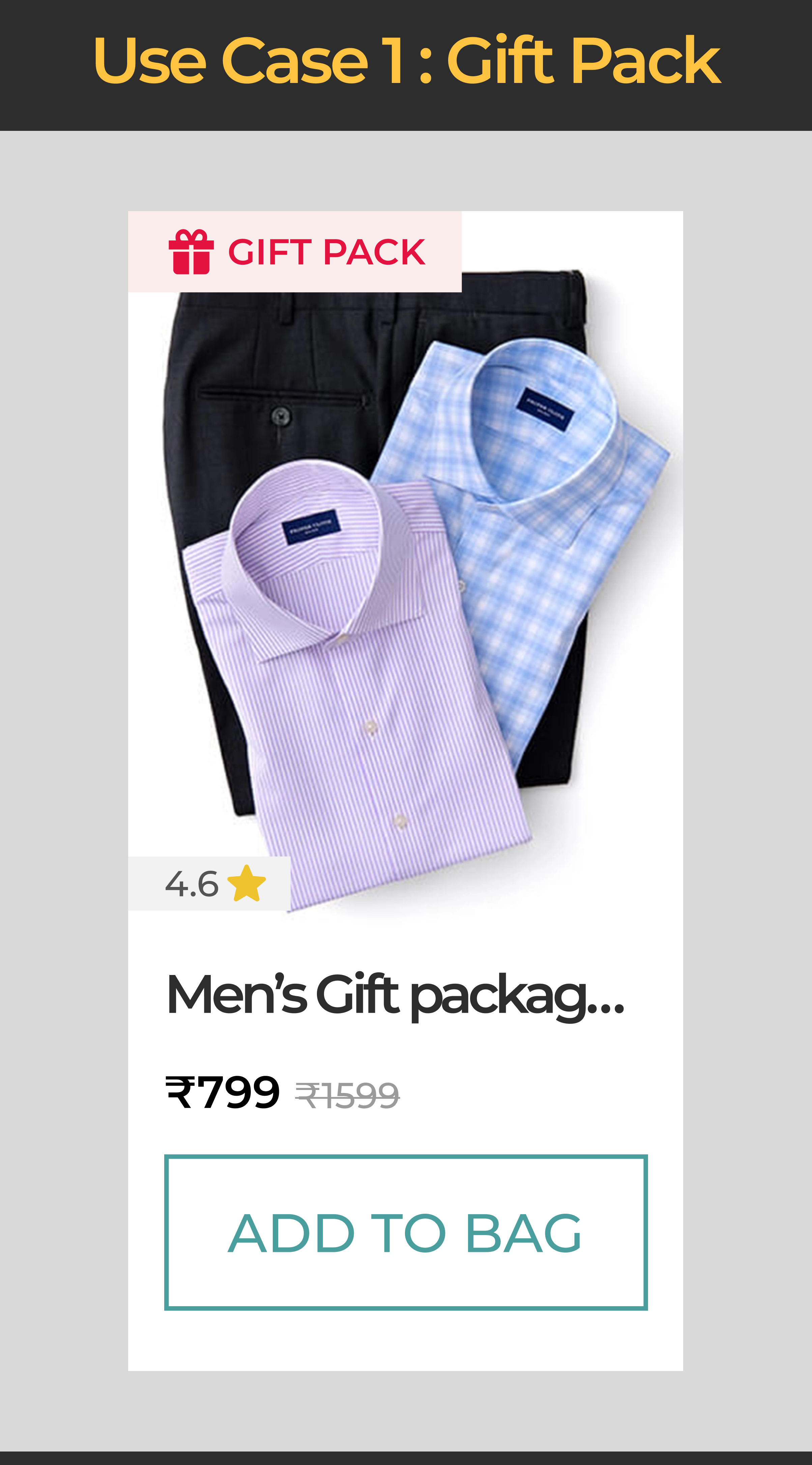
🎁 Use case 1 : It is a Christmas season users are in the mood of gifting their loved ones with clothing. How does this upsell feature cover that ?
The Goal of Upselling is much easier to achieve at a season like Christmas when the UI communicates the message well
So I decided to make it a gift package reinforcement to allow users to buy clothing in packages as a gift instead of Tshirts that come loose in a plastic bag.
I believe this reinforcement can be used in all seasons of celebration and happiness.
This allows users to easily pick right gifting options and increase the chances of buying there by rising the average order value throughout the season.
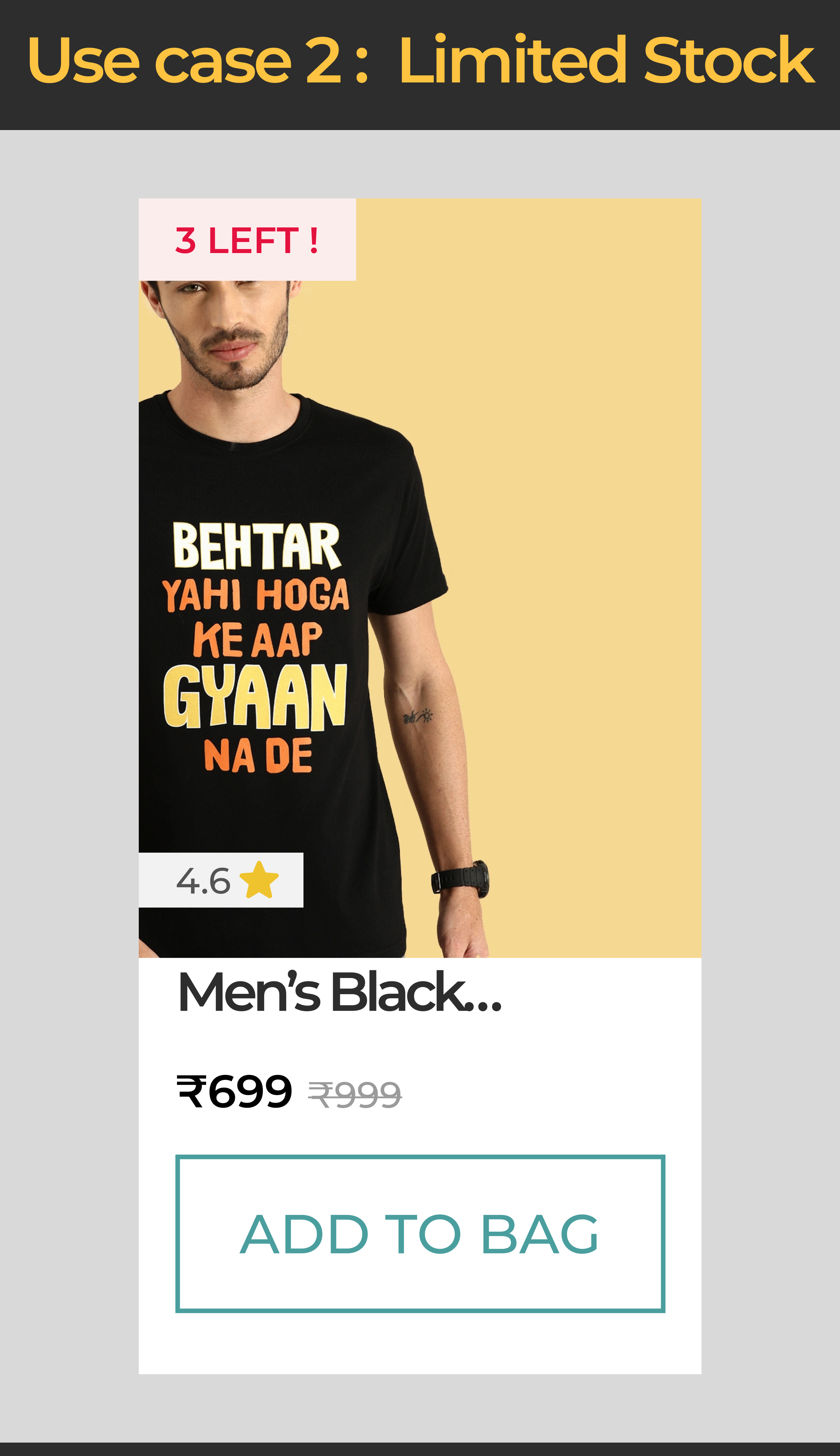
🏃♂️ Use case 2 : What if the product is limited in the inventory ? How does the upsell feature tackle such condition ?
As a Business its very important to convey the live status of the inventory with users to avoid accidental purchase mistake which can cause issues with customer and can even potentially lead to drop off.
Visibility of the system status which in this case the availability of the product upsold is very important for error prevention
These are important usability heuristics that give a direction to flawless usability of the app
To showcase this the communication of number of items left in stock was a better choice that enables users to understand that it might get out of stock soon
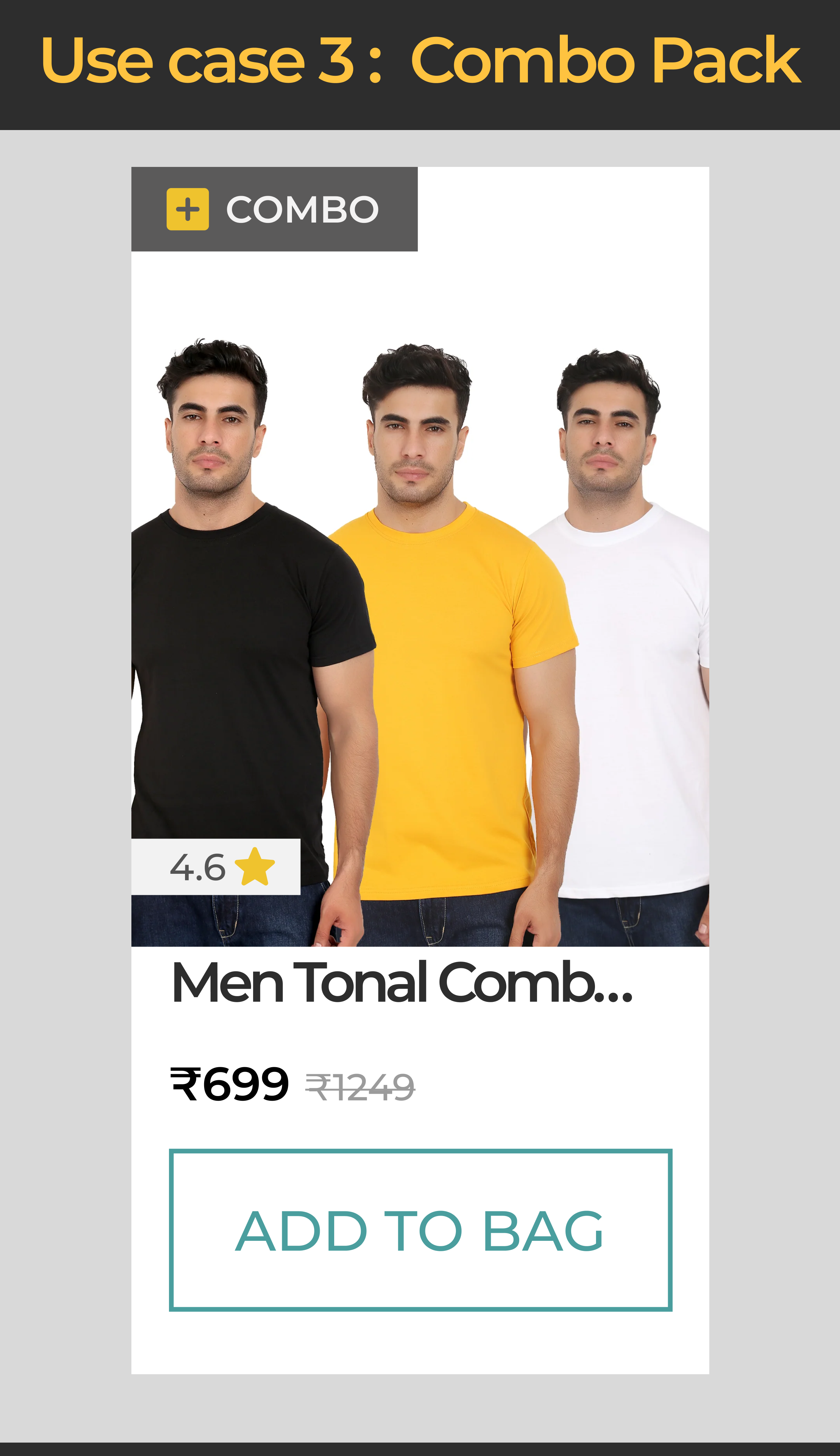
Use case 3 : What if the user is on a budget and wants to buy combo packs to save some buck and buy in bulk ? How does the upsell feature cover that ?
While conversing with one of the user about his purchase pattern I observed that he usually buys clothing once in 3 months as a combo mostly covering basic essentials like monochrome T-shirts
This Behavioral pattern was observed in other 2 users while probing them. It led me to the thought of incorporating combo packs as reinforcement to the upsell feature

Bulk purchase behavior noticed in users
Bulk purchase behavior noticed in users
This enables users to achieve their personalized goal of buying in bulk as well as benefit the overall revenue of the business by suggesting relevant items as per purchase order
In this manner I asked multiple questions that allowed me to come up with 12 different variations of use cases and edge cases like
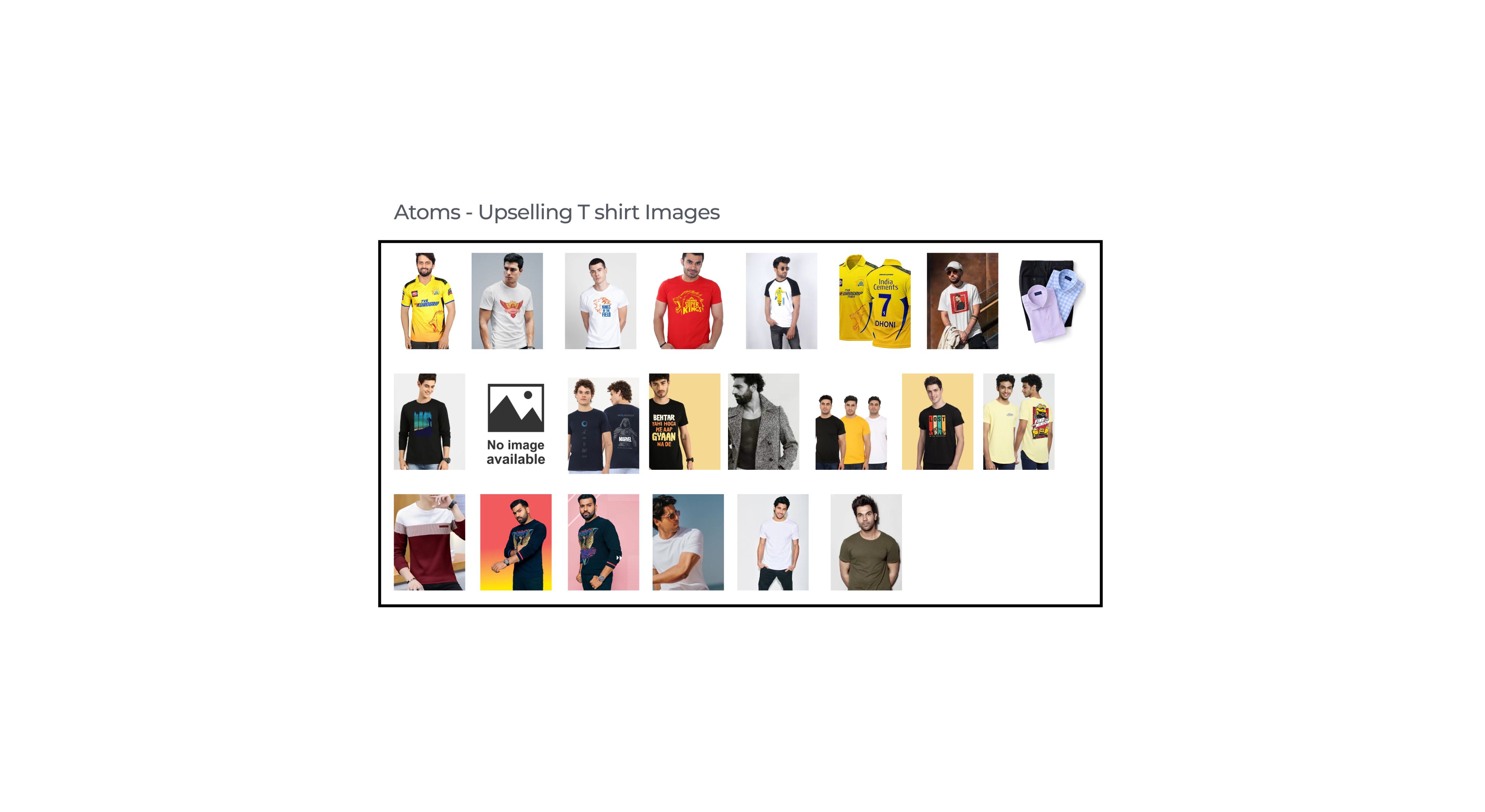
What if the product image is not present ?
What if the product is out of stock ?
These questions played an important role to build a component based Atomic design system for the upselling feature
Checkout the UI component architecture I used to build it 👇


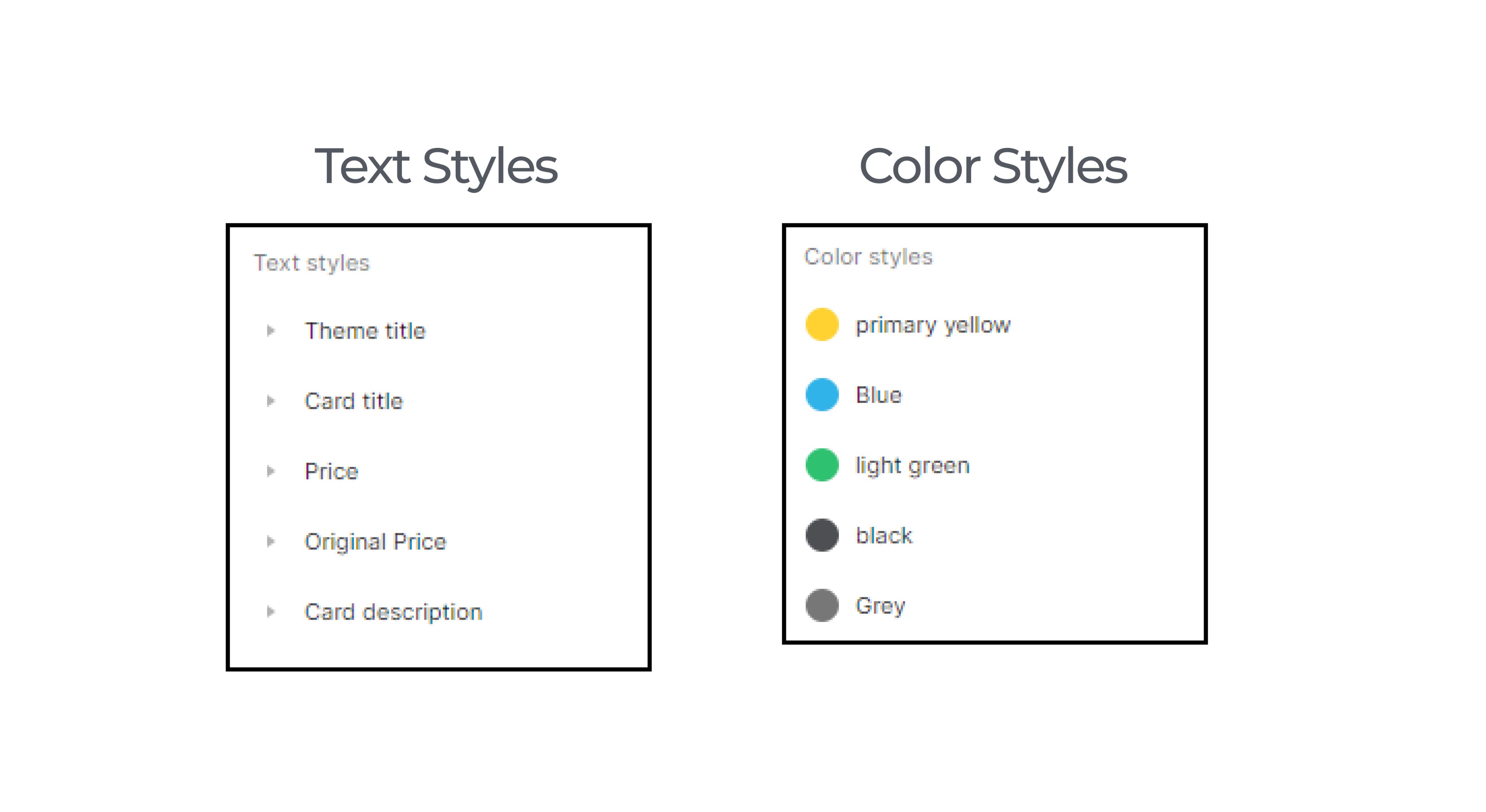


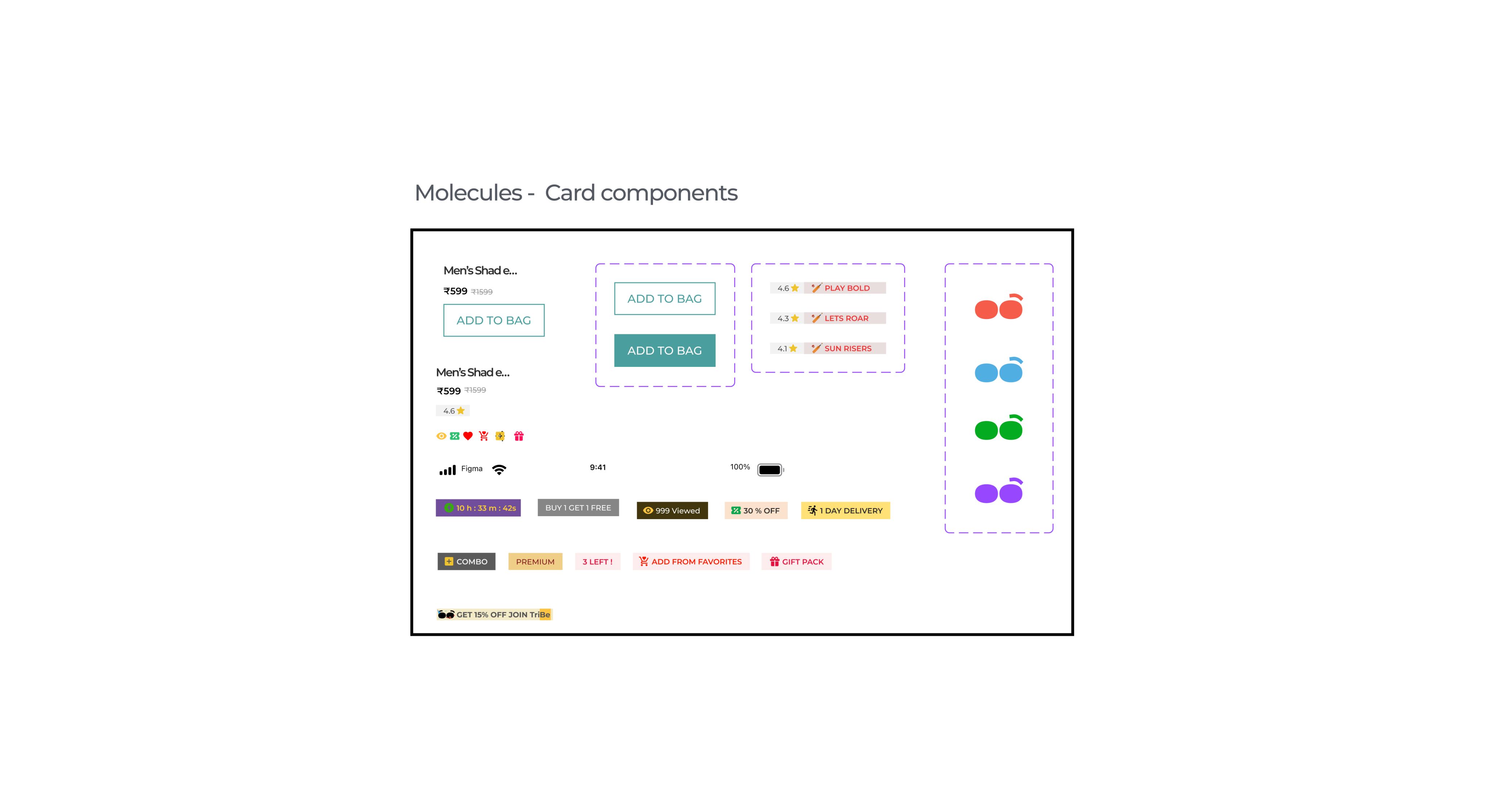

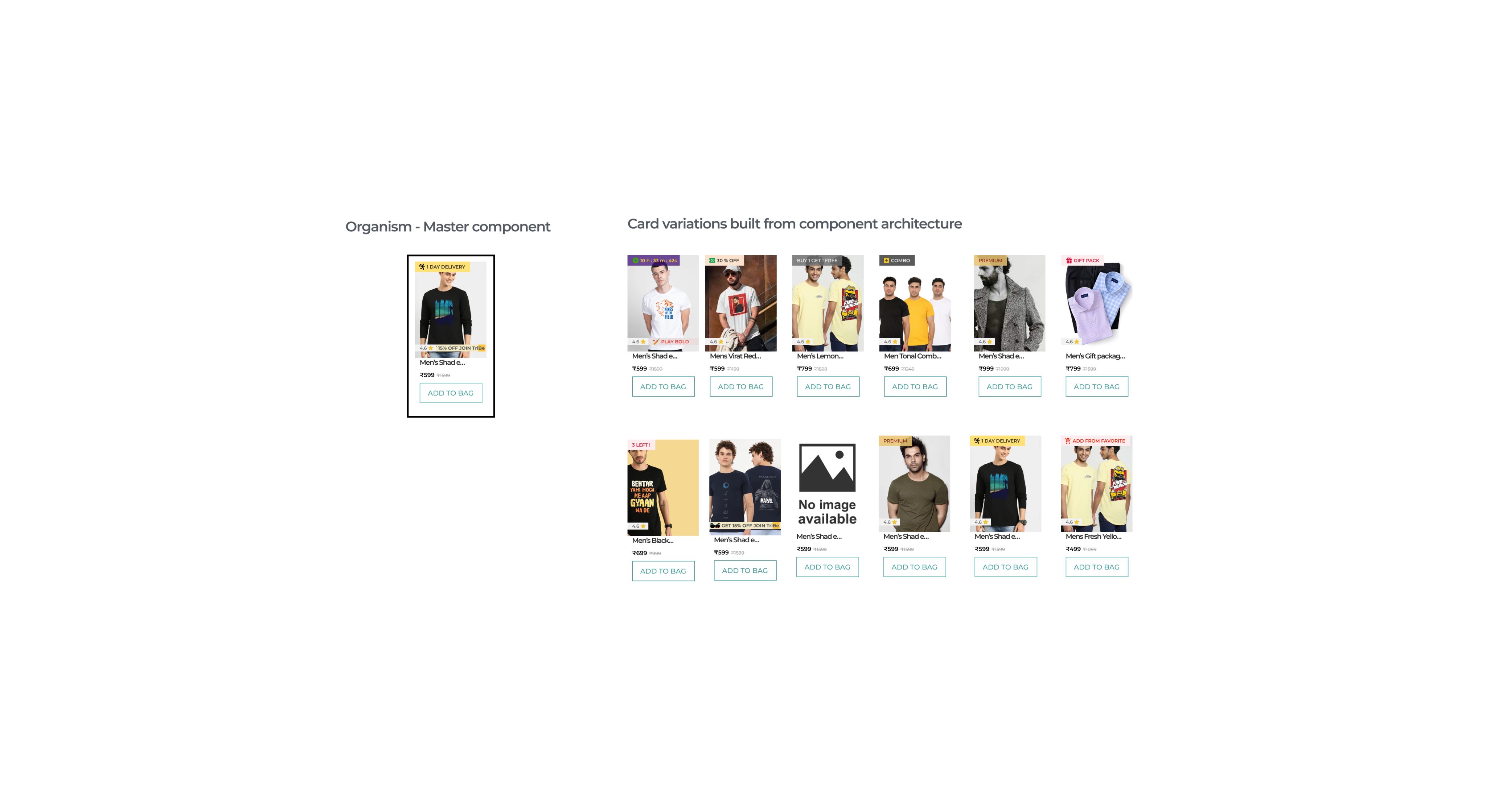

Utilizing component properties
That's a wrap!
Future Scope
As the entire project was built in 48 hours it was difficult to test with a good number of people
In the future to continue the project I will iterate on the upsell cards readability and usability
I would also consider refining the system and add more of use cases and edge cases to support upselling across different pages like Product description and checkout page
Learnings
- While testing with one of the user I understood that the placement of a irrelevant upselling card ( like a slipper in between Tshirts ) that doesn't match with the item added to the cart will really make the feature useless
- Though cross selling involves showcasing a new product, if it doesn't complement to the item added to the cart user don't consider it as value adding and simply ignore it
- Giving a lot of features ( like the wishlist feature I added initially ) that adds to user control and freedom in the upselling feature will lead to more exploratory behavior thereby acting as distraction rather than adding value to the business
- Asking a lot of questions on what happens in this scenario? helped me steer the design from placement prior to checkout to building a system that can be used anywhere across the information architecture of bewakoof
Regards to my mentor Anudeep Ayyagari for guiding me through, and helping me unlearn to learn better, and heartfelt thanks to my group members who took out their precious time to stay awake late at night and keep up the motivation. This journey is a cherishable memory.
❇️ Your feedback will be highly appreciated, and I am grateful for the time you took out to read this. To connect kindly reach out on LinkedIn.
#studentforlife
Linkedin : https://www.linkedin.com/in/srirammanogarux/
Email me : srirammanogarux@gmail.com